About MedzHOUZ
MedzHouz provides pharmaceutical care to a wide range of patients and customers of any age over 18. At this online pharmacy, quality, time, safety, and costs are the core values. With a new vision on solving old problems, this site will be an online shopping market to sell a wide variety of products from over-the-counter or prescription medication to vitamins, health, and beauty products. Prescriptions are filled and delivered by mail.
IDEATION
The year 2021. A Worldwide Renaissance that has been associated with tremendous social changes. A different way of communication and work culture. The explosive growth in the number of digital applications. Many aspects are continuously changing and adapting to current situations and making modifications. These continuous changes reflect our ability to shop and purchase medications and visit doctors. This is the reason that the idea began to shape.
Style Concepts
This site’s overall goal is to provide its frequent users of any age an easy and effortless experience to purchase and receive their medications while exposing them to the necessary information. This site’s challenge is to earn users’ trust and establish an accurate, convenient, and fast way of communication.
Attributes that capture the essence of the brand
Making it easy
Anyone can use it
Simplicity
Organization
Trustworthy
The color palette displayed on this site represents freshness, calmness, trust, and loyalty. It will create stress-free feelings that motivate users to make a decision and complete the tasks.
logo creation
The inspiration for the MedzHOUZ logo comes from staying loyal to the pharmacy’s branding; clean, minimal, and modern. Since this is a logo for an online pharmacy, the overall vibe of the brand facilitates a sense of freshness, calmness, trust, and loyalty. I implemented both type and visual/icon treatment to make the logo prominent and easy to read. The logo is a vector shape and is made in Illustrator.
USE OF IMAGERY
Images will create a look that is professional and strong. The identity feels trustworthy and unmistakable. When users view this website, they feel they are in the right place to buy their prescription medications.
Values:
To display clear and high-resolution images for the digital resolution of the photo.
To prevent clutter. All medications will display on white background.
A simple, clean product shot and details shot will be used. An angled shot might be used if better communication of the product benefits is achieved.
To present no excessive element, Only images that are relevant and add value.
To avoid busy images with too much detail.

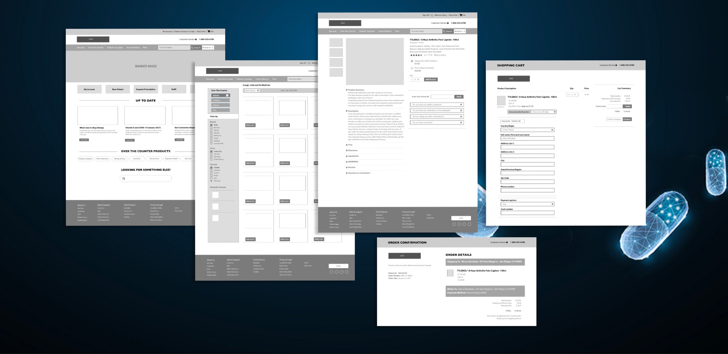
Wireframe Mockups
Evaluation
THE OBJECTIVE OF USER TESTING:
The objective of this evaluation is to adopt and always to improve.
It is essential to determine if the site meets the users’ needs and users can easily interact with the site. By collecting data that explains users’ behavior, and testing can ensure the plan meets expectations upfront. The goal is to find design issues with the site, analyze the problems, and fix the problems
METHODOLOGY
This User experience will be evaluated with both qualitative and quantitative measures.
Users will be given particular tasks
User interviews.
Direct observation method in Natural settings
Contextual Inquiry
USERS
For this evaluation, I picked four users. Based on my studies, observing their behavior and reactions, users answered the questions and observed the tasks depending on their mood and attitude towards solving problems in real life. Not only their answers helped me to improve the site, but they also reflected their personalities.
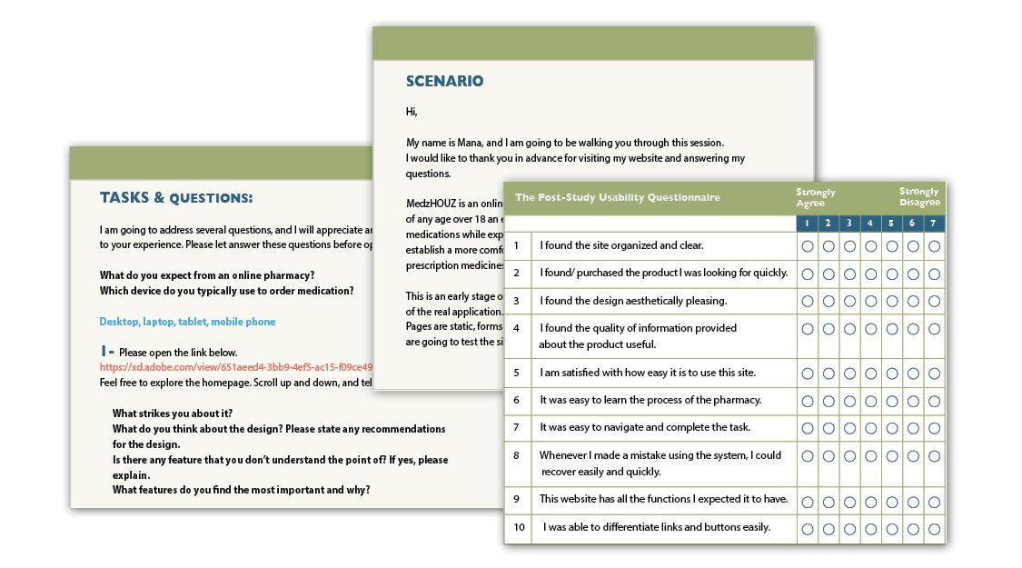
Usability test script and plan:
Data evaluation:
Users were satisfied with the overall look and layout.
Users completed the task efficiently and quickly.
The navigational system was easy to understand.
Easy to find product and information that user was looking for.
The checkout process was straightforward.
Small changes will need to be made to the Architectural organizational issues.
Overall Concept
85%
Of the participants understood the core premise and overall concept of this site.
95%
Of the participants enjoyed the concept and the overall experience.
85%
Of the participants successfully completed all tasks related to the overall concept of the site.
15%
Of the participants experienced difficulty using the site.
Solutions:
After usability testing and validating the issues, some navigational system visibility and architectural issues identified potential problems with the design, creating areas for improvement.
To avoid confusion, the text label “Virtual Care” was changed to the “Chat with a pharmacist” label.
To solve the problem of long pages and long forms, fixed-position navigation bars were implemented.
The prototype needed more clarifications about insurance. The solution was to create a prominent position for subtitles with insurance information following the Fitts Law principles.
Shopping cart placement, size, and color changed to a more prominent and visible place, considering recognition, not recall principle.
Two independent links for the “Login” & “Create an account” pages were implemented.
Added a new option to set up for an exclusive membership to receive more care, especially for patients with disabilities.
Responsive Design
Strategically designed and planned for a wide array of devices for ease of use.

prototyping
A complete shopping process through to transaction confirmation.


